
Skip to content
Rapidyx

A brand that doesn't stay in a PDF.

Your brand in 3 weeks, made by the same team that later builds your website, your app or your BOT. The colors and measurements go straight into the code: what you see in the guidelines is what you see on screen.

Sebastián Galli

Sebastián Galli, the founder, gets back to you in under 2 business hours.

A page from the Ciclo Pink brand guidelines that builds itself in four steps: the logo with the peony, five colors with their codes, the app's typefaces, and the brand applied to the app icon and the Today screen.

This is how brand guidelines come together: the logo, its colors, its type and the places where it lives. These are the ones for Ciclo Pink, Pink Lady's app, which we made end to end.

Four ways to build your brand.

Each one says who it's for, how long it takes and which of our projects proves it.

  1. 1

    Social media and stationery kit

    10 calendar days · from the signed proposal

    You already have a logo, yours or one made with us, and you want your social media, your business card and your email to look like one brand.

    If your logo only exists as an image, we redraw it as a vector, like we did with ours. If you don't have a brand yet, start with Visual identity.

    Proof: our business cards and our logo redrawn as a vector; rooota's post, story and profile picture; Ciclo Pink's splash screen, with the peony.
  2. 2

    Visual identity

    21 calendar days

    You're starting a business, or your logo doesn't hold up: it looks bad when small, it has no versions and every supplier uses it differently.

    Proof: rooota (the logo in 4 forms and 4 colors, the app icon and the browser tab icon, readable at 16 px) and Ciclo Pink (the logo, the app icon and the Mini manual).

  3. 3

    Full brand with guidelines

    42 calendar days

    You're about to launch something with many pieces (app, website, social media, a store or vehicles) and you want anyone on your team or among your suppliers to make them without breaking the brand.

    Proof: rooota, with its 41-page brand guidelines: the van with three windows, 48 icons, 3 patterns, 6 illustrations, the social media pieces and the website animation; and Ciclo Pink, with its 14-page Mini manual and the peony in four stages.

  4. 4

    Design system for your app

    30 calendar days · up to 20 key screens

    You have the brand and an app with many screens that your team or another supplier will build, or one that already exists and has been drifting apart. It's your app's set of building blocks, with its rules written down, so every new screen comes out like the ones before.

    If we build the app, you don't need it to begin: the design of the key screens is already included in the MVP app. If it's bigger, 6 to 8 weeks, with a price and a date in writing.

    Proof: Ciclo Pink (253 screens in Figma), rooota (32 component families, with the colors and measurements in 7 formats for the code) and the redesign of the UGC Point app (69 screens and three directions to choose from).

What we don't do: trademark search and registration, the name, Pantone colors, printing or vinyl wraps. We show you vehicles and signs as mockups.

Not sure where to start? Message us on WhatsApp and we'll put together three options.

What each one includes, how much it costs and how you pay are on the Pricing page.

See pricing

Case study · Pink LadyFull brand with guidelinesDesign system for your app

Ciclo Pink: the brand, the guidelines and the whole app.

For Pink Lady we did everything: the brief, the brand and its Mini manual (logo, app icon, splash screen, five colors and a peony that goes from bud to full bloom with each phase of the cycle) and the app's design system.

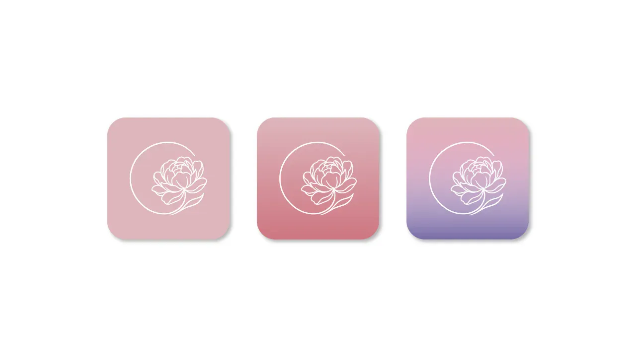
  • Mini manual page: the app icon, the peony inside an open ring, on three backgrounds.
    The app iconMini manual · page 6 of 14
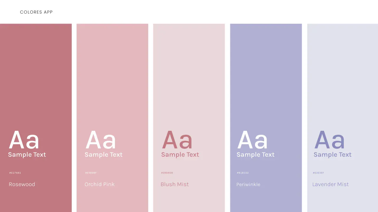
  • Mini manual page: the app's five colors, Rosewood, Orchid Pink, Blush Mist, Periwinkle and Lavender Mist, with their codes.
    Five colors, with their codesMini manual · page 8 of 14
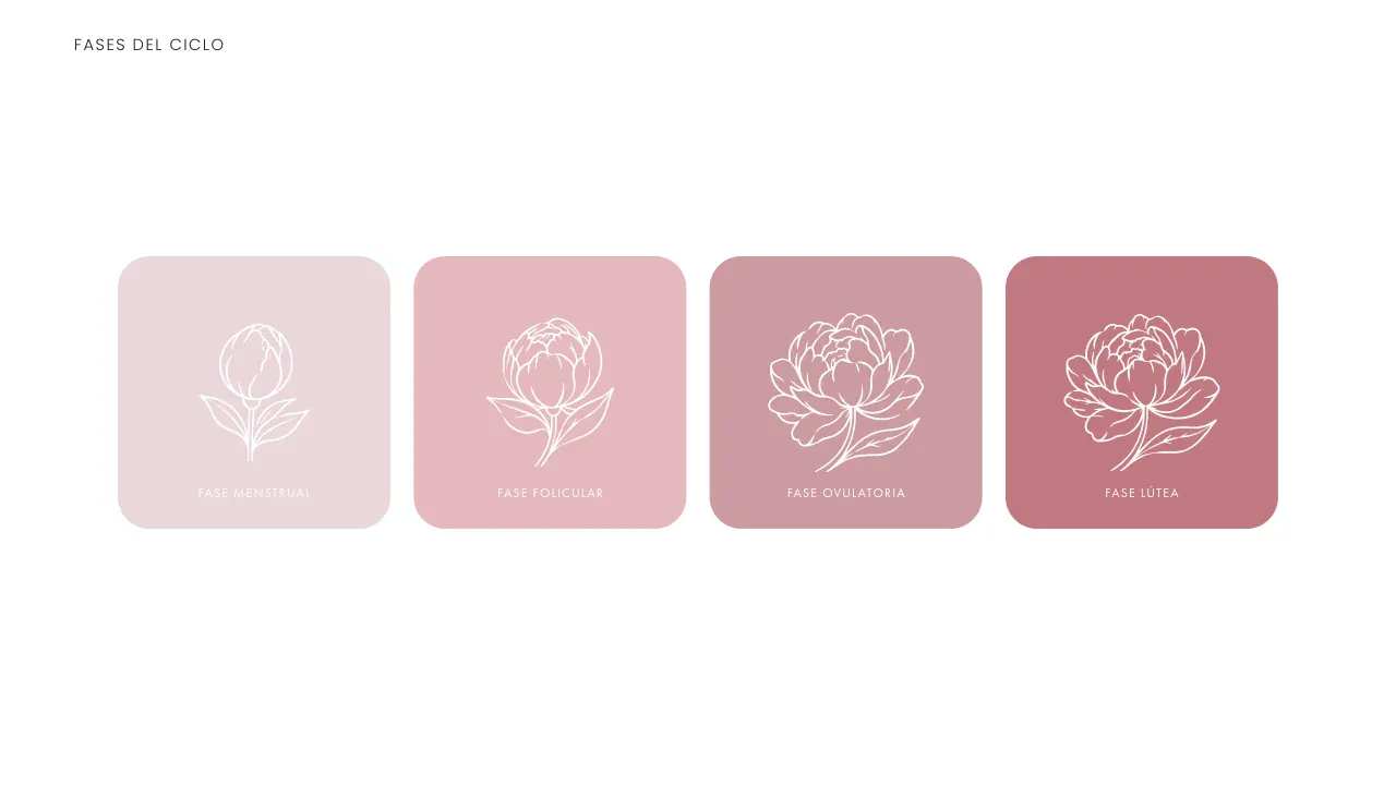
  • Mini manual page: the four phases of the cycle, each with its peony and its color, from bud to full bloom.
    One peony per phaseMini manual · page 11 of 14

The brand, inside the app.

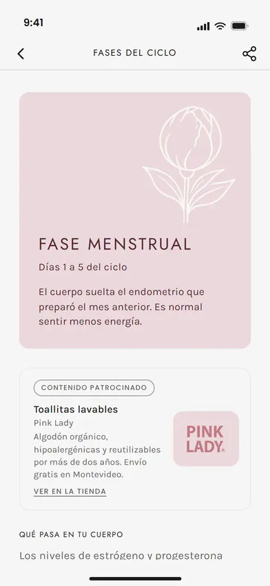
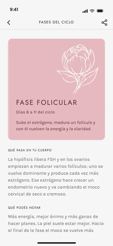
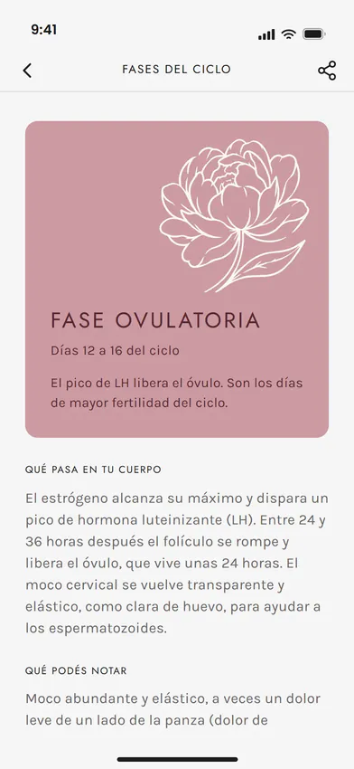
The peony opens with each phase of the cycle and gives the screen its color. Four cards from the app, one per phase.

  • The menstrual phase card in Ciclo Pink: the peony as a bud on Blush Mist.

    MenstrualBud

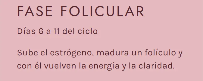
  • The follicular phase card in Ciclo Pink: the peony opening on Orchid Pink.

    FollicularOpening

  • The ovulatory phase card in Ciclo Pink: the open peony on dusty rose.

    OvulatoryOpen

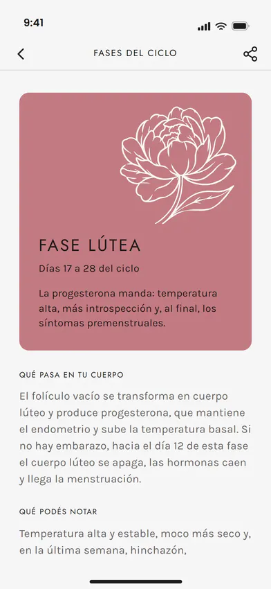
  • The luteal phase card in Ciclo Pink: the peony in full bloom on Rosewood.

    LutealFull bloom

From the guidelines to the product, without losing anything.

The guidelines didn't cover everything: we extended them to contrast for small text, the calendar, the cycle chart, the back office and the emails, with every decision written down. When Pink Lady asked for changes, the system absorbed them.

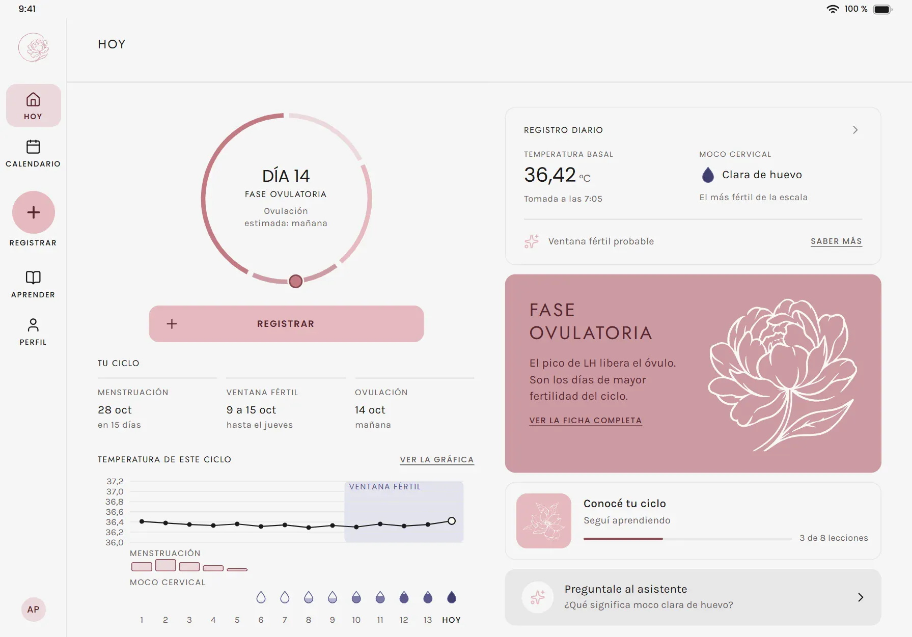
Ciclo Pink on iPad: the day of the cycle, the temperature log and the ovulatory phase card with its peony.
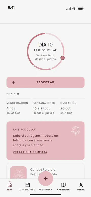
Ciclo Pink on iPhone: the Today screen, with the cycle ring and the button to log the day.
253
screens: iPhone, iPad, Android, desktop and emails
18
modules, each with its screens
37
color and shape variables in Figma, used by all 253 screens
31
decisions written down in the design system
15 + 79
new and adjusted screens when Pink Lady asked for changes
14
pages in the Mini manual

What it proves: Full brand with guidelines and Design system for your app. The brand, the Mini manual and the 253 screens are ours, from the brief to Figma: one team, without passing the brand from hand to hand.

Read the full case study

Case study · roootaFull brand with guidelinesVisual identitySocial media and stationery kit

rooota: a van with three windows and a whole brand.

We started from a name and an idea. The name, rooota, was chosen by its founder; the idea was a van with windows. We solved it in three variants, Combi won, and around it we built the whole brand: the guidelines, the icons, the patterns, the social media pieces, the app and the website animation.

A van. Three windows.

  • The van

    High roof and a compact silhouette: it reads the same on an avatar and on a sign.

  • The three “o”s

    The windows are the letter “o” of the name, in the brand's typeface.

  • The name

    In lowercase and without “.com”.

41
pages in the brand guidelines
16
versions of the logo: 4 forms in 4 colors, as SVG and PNG
15
colors with their codes, and 22 contrast pairs measured
48
icons drawn on a 24 × 24 grid
3 + 6
patterns and original illustrations, no stock photos or icons
32
component families, with the colors and measurements in 7 formats for the code

The signature, from a sign to a browser tab

  • Horizontal · the main one
  • Vertical · compact pieces
  • Wordmark only · short spaces
  • Symbol · the Combi van
App
Profile
48 px
32 px
16 px

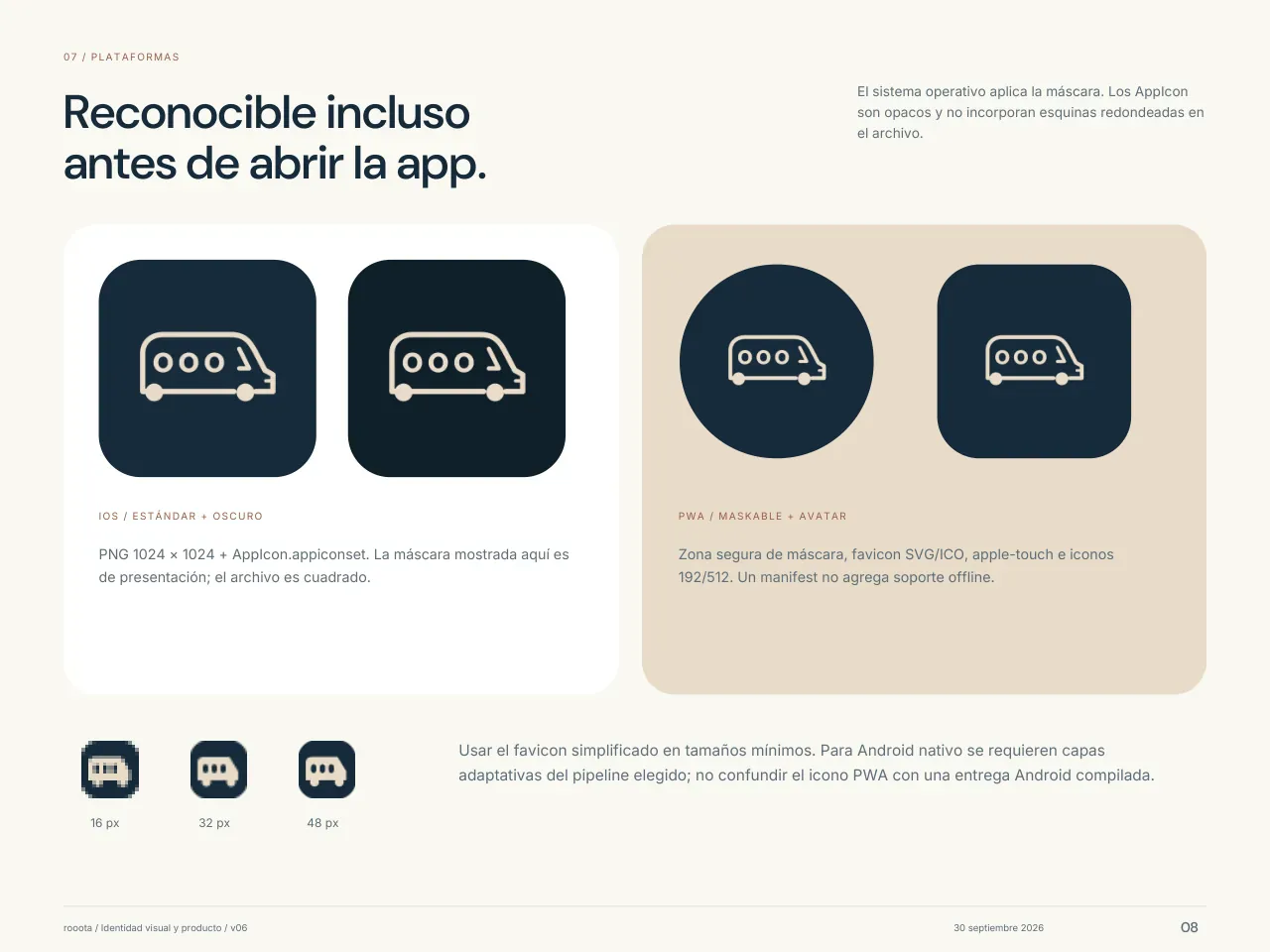
The browser tab icon, redrawn so the van reads at 16 px.

Colors and type

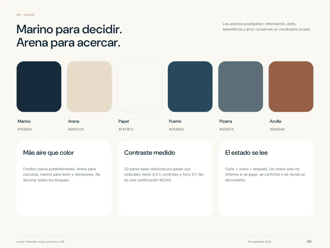
  • Navy#162B3A
  • Sand#E8DCC8
  • Paper#FAF8F3
  • Harbor#29485D
  • Slate#5E6E7A
  • Clay#986048

For states and illustrations

  • Success#286355
  • Warning#82560D
  • Error#A3323B
  • Info#315D87
  • Sage#D8DFD6
  • Coast#93ABB0
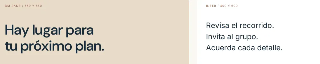
rooota's typefaces in use: a two-line heading in DM Sans and three short lines of text in Inter, from the typography page of its brand guidelines.

DM Sans headings and buttons

Inter text for reading

The guidelines, page by page.

Nine of the 41 pages, just as they were delivered: from the logo and its colors to color, icons and patterns, and from there to the buttons, the app and social media.

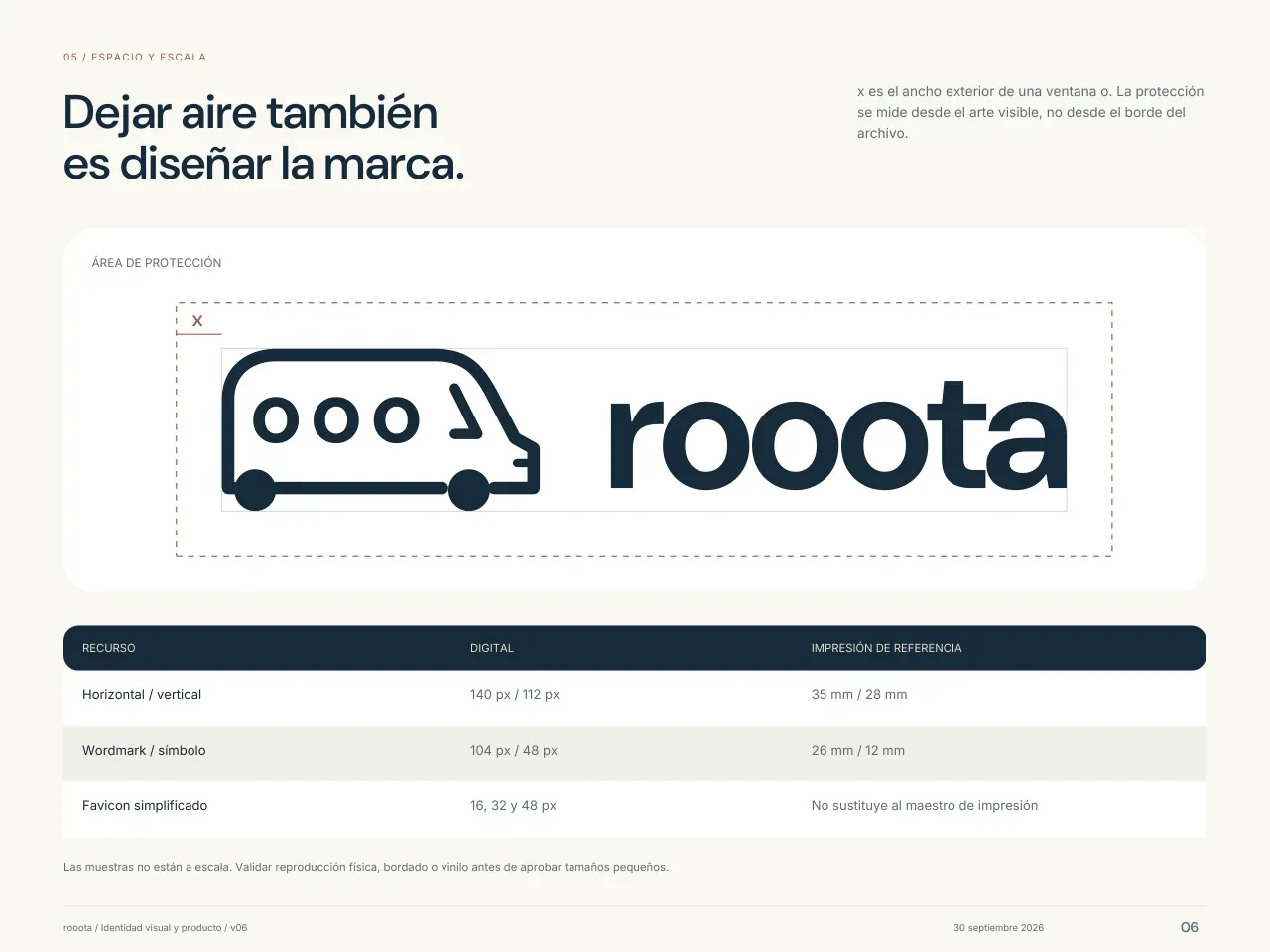
Page “Leaving space is also brand design”: the logo with its clear space, measured with the width of a window, and the minimum sizes table: horizontal 140 px, vertical 112 px, wordmark only 104 px, symbol 48 px and favicon at 16, 32 and 48 px.
Clear space and minimum sizesPage 6 of 41 · logo and construction
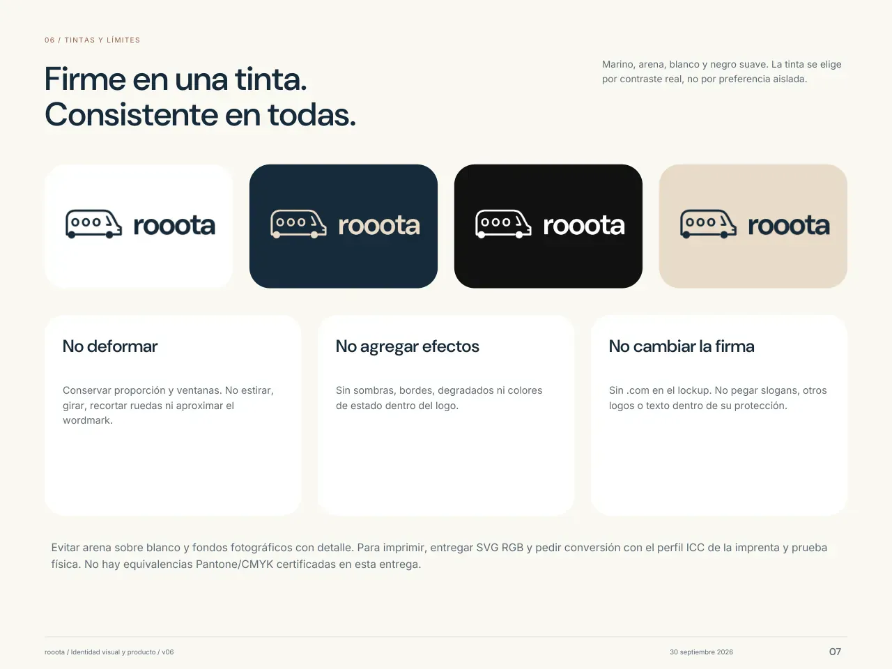
Page “Solid in one color. Consistent in all of them”: the logo in navy on white, sand on navy, white on black and navy on sand, with three rules: don't distort it, don't add effects and don't change the signature.
Four colors and three rulesPage 7 of 41 · logo
Page “Recognizable even before you open the app”: the iPhone app icon in light and dark, the web version as a circle and a square, and the favicon at 16, 32 and 48 px.
The app and the browser tabPage 8 of 41 · platforms
Page “Navy to decide. Sand to bring closer”: six colors with their codes, Navy #162B3A, Sand #E8DCC8, Paper #FAF8F3, Harbor #29485D, Slate #5E6E7A and Clay #986048, and three rules: more space than color, measured contrast and a readable state.
Color, with its codesPage 9 of 41 · color
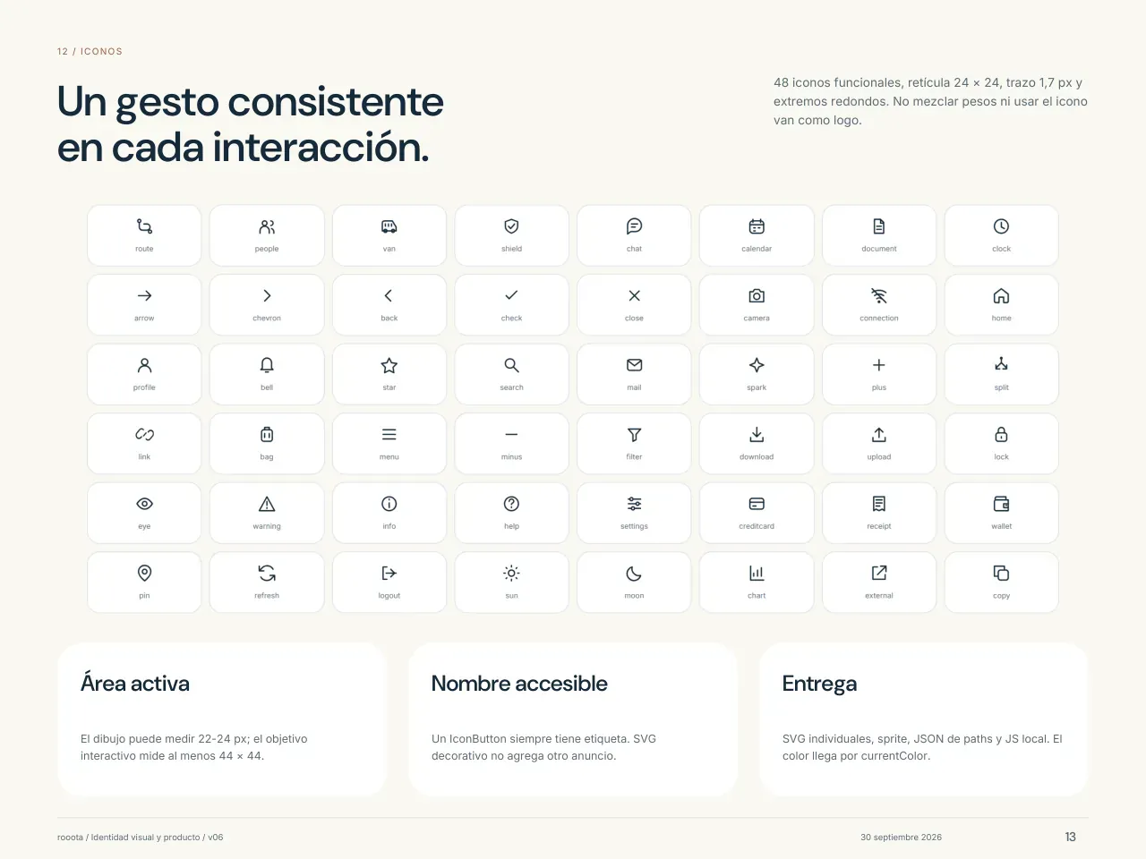
Page “A consistent gesture in every interaction”: the system's 48 icons in a grid, each with its name.
48 iconsPage 13 of 41 · icons
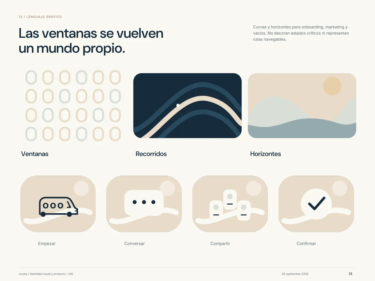
Page “The windows become a world of their own”: the “o” window pattern, the routes on navy, the horizons and four illustrations: Start, Talk, Share and Confirm.
Patterns and illustrationsPage 14 of 41 · graphic language
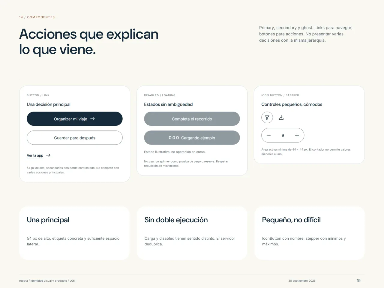
Page “Actions that explain what comes next”: the brand's buttons (primary, secondary and link), the disabled and loading states, and the small controls, each with its size.
Buttons and statesPage 15 of 41 · components
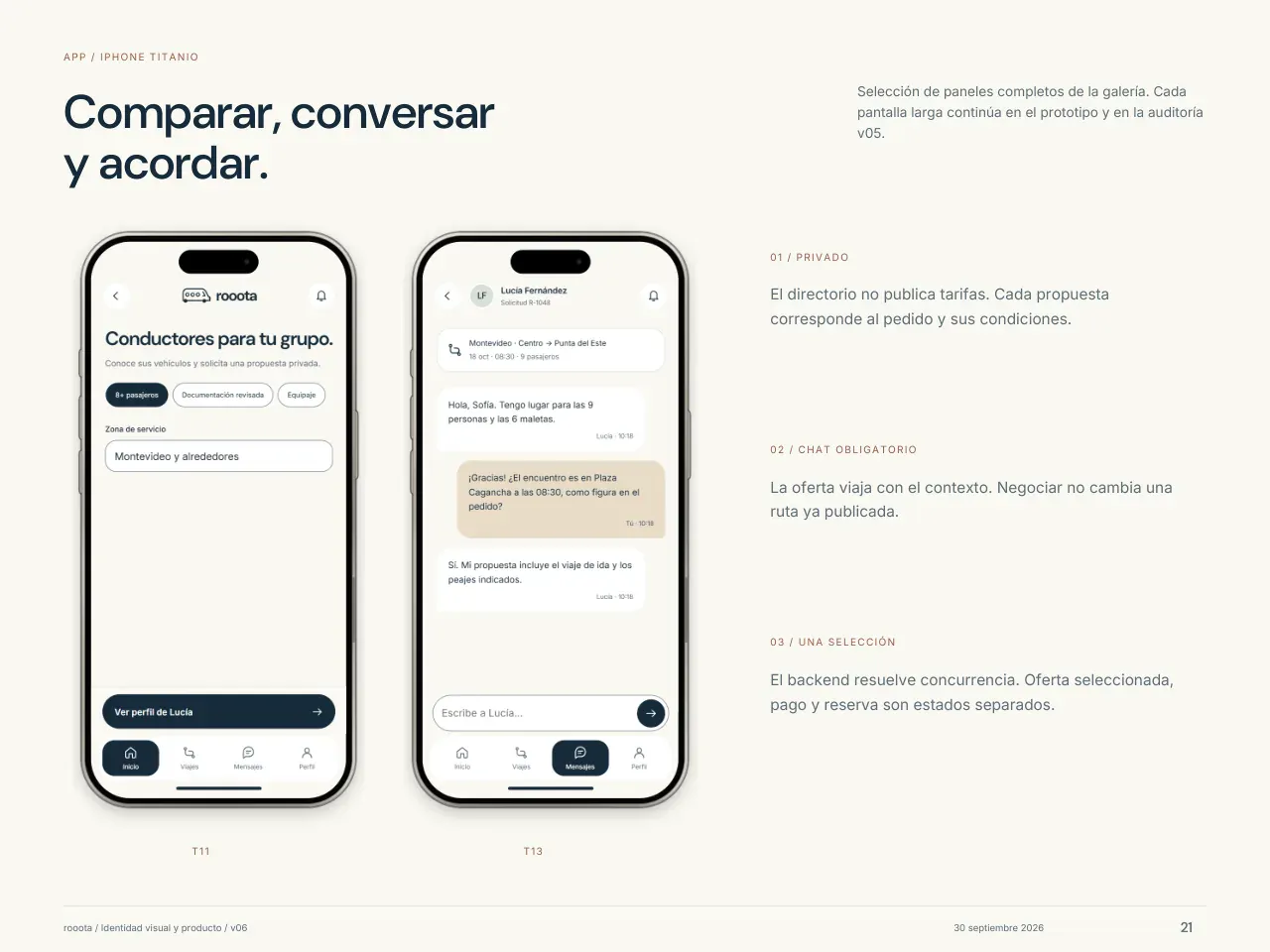
Page “Compare, talk and agree”: two app screens on iPhone, the directory of drivers for a group and a chat to agree on the trip, with example names.
The brand, inside the appExamplePage 21 of 41 · from the brand to the app
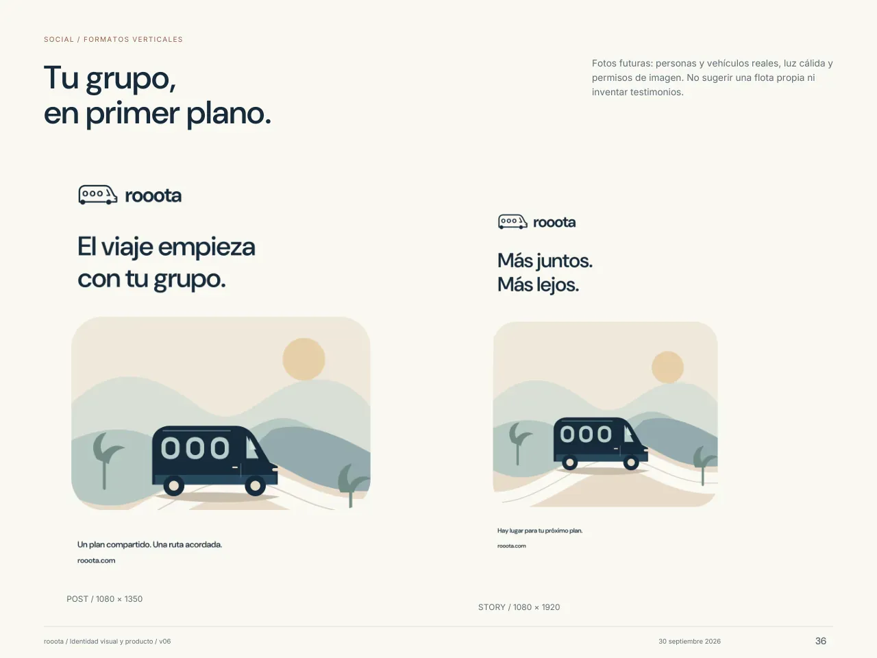
Page “Your group, front and center”: a 1080 × 1350 post and a 1080 × 1920 story, each with the logo, a short title and the illustration of the van on the coast.
Post and storyPage 36 of 41 · social media

The brand grows with the product.

When the service added cars, minibuses and buses, the window rule became a family: two windows for the car, three for the van, five for the minibus and seven for the bus. And the brand moves: the website animation tells the product's story in 12 seconds, with the same colors, type and illustrations.

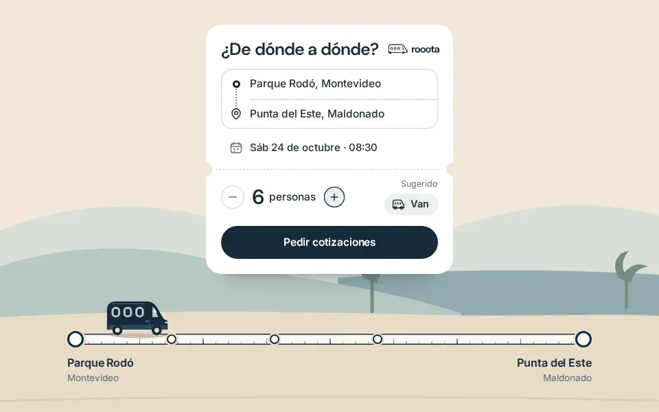
A frame from La Ruta, the rooota website animation: the “From where to where?” card with a sample trip from Parque Rodó to Punta del Este for 6 people, the button to request quotes and the van at the start of the route, by the coast.
La Ruta · a frame from the website animation, with a sample tripExample
  • Car2 windows
  • Van3 windows
  • Minibus5 windows
  • Bus7 windows
The vehicle family · the four drawings the website uses, with the window rule

What it proves: Full brand with guidelines, Visual identity and the Social media and stationery kit. It's the brand rooota uses today, whole: the van, its 16 versions, its colors, its type, its icons and guidelines that go all the way down to the code.

We made ours too.

Our logo only existed as an image: we redrew it as a vector so it works at any size. With it we made the team's business cards, ready for print: in print colors, with a 3 mm bleed and the text converted to outlines.

And we left it in its four color versions, for light, dark and colored backgrounds. It's the same thing we deliver in Visual identity and in the Social media and stationery kit.

Front of the Rapidyx business card: the logo in white over blocks of blue, with the tagline in Spanish (custom software development).
Team business card · ready for print. Flip it to see the back
  • Rapidyx logo in color on a light background
  • Rapidyx logo in color on black
  • Rapidyx logo in white on blue
  • Rapidyx logo in black on white
The logo as a vector · color, on dark, white and black

How we build your brand.

We show you finished directions, already applied, not sketches on a white background. You choose; we build the system.

  1. You message us

    On WhatsApp: what you do, who it's for, which brands you like and which you don't. If you already have a logo, send it.

  2. Price and date in writing

    Within 2 business days we send you what's included, how much it costs and when it's ready. What we sign doesn't go up.

  3. Kickoff call

    Where the brand will live (app, store, social media, vehicle, stationery), who your competitors are and what it needs to say.

  4. Finished directions

    Between days 5 and 7 we show you 2 directions (3 in Full brand, between days 7 and 10), already applied to your real pieces. You pick one.

  5. Rounds of changes

    On the chosen direction, with an update every week so you can see how it's going. The dates assume you reply to each round within 2 business days.

  6. We build the system

    Versions, colors with measured contrast, the 16 px and black-and-white test, guidelines, icons and files for the code, depending on what you chose.

  7. Delivery

    A folder with everything (SVG, PNG, PDF, Figma, licensed fonts and files for the code) and a page to browse it. The files and the rights are yours.

  8. The brand goes into the product

    If the website, the app or the BOT comes next, the same team uses the same colors and measurements in the code.

How you pay, the warranty and what happens if we're late: the same as in every plan. It's all on the Pricing page.

See pricing

What people ask us about branding.

Got another one? Message us on WhatsApp.

I already have a logo. Where do I start?

With the Social media and stationery kit. If your logo only exists as an image, we redraw it as a vector, like we did with ours. If it looks bad when small or every supplier uses it differently, Visual identity is the better fit.

What's not included?

Trademark search and registration, the name, Pantone colors, printing and print proofs, and vinyl wraps for vehicles and signs (we show them to you as mockups). The business card does come ready for print.

Are the files mine?

Yes. The editable files (Figma, SVG and vector PDF) and the rights are yours. The fonts we use are free-licensed.

How much does it cost?

It's on the Pricing page, with the rest of the list. Here we tell you what each one does, how long it takes and which of our projects proves it; we send you the price and the date in writing within 2 business days.

See pricing

Tell us what your brand needs to say.

Sebastián Galli, the founder, gets back to you in under 2 business hours. If you already have a logo, send it in the same message.

What do you need?

Here's your message

Sebastián Galli, Rapidyx+598 95 203 242

Hi Rapidyx! I want to work on my brand. Could you put together three options?

10:42

Message us on WhatsApp

WhatsApp opens with this message and you send it yourself.